Critique #1 2013

Discussions on Equipment, Locations and Tips for getting the photographs you want of Vermont scenes.Note: You must be registered in order to post. If you have trouble registering, use the contact us form on Scenes of Vermont's home page.

Moderators: Andy, admin

Post Reply
deaner1971
Posts: 449
Joined: Wed Sep 03, 2003 12:01 am

Critique #1 2013

Post: # 16522Post deaner1971
Fri Feb 15, 2013 8:47 am

OK, not really looking for a traditional critique (though feel free to opine as I always value this group's input) but looking more for technique input. The reason I am differentiating is that I know there are issues with these images and that is exactly why I am sharing them.

Winter in Ohio is usually like lipstick on a nun: a bit pointless.

Having a mostly flat topography and rarely picturesque snow but insufficient low temps to get things to freeze in interesting ways makes winter effectively a gray season of sticks against a mostly brown background.

Bit, being an avid amateur photographer/glutton for punishment (sorry, was that redundant?) I still head out. A recent downpour had convinced me to head out and work on my moving water technique. The area in question is a gorge with little light until the sun is high and well past the ideal hours. So, to get the shot you end up shooting in shadow while trying to avoid blowing out the upper portions of the frame.

Generally, my instinct is to go to the bad light photographer's best friend: B&W. And thus, the first question: right call to go monochromatic?

From there, the questions abound: yes, but how could I have done B&W better? No, and how could I have made the poor colors better? Would it have not been better to stay home rather than waste gas driving to shoot in such conditions? Is it time to give up and sell my camera gear for some paint supplies and see if I can make that work? Etc...

Since I attract bad weather like Los Angeles attracts the egocentric, bad light is a near constant with which I need to better cope (unless I do that painting thing in which case I can pretend I am not the Pigpen of meterology) so, your insights are welcome.

Here are the original images and their B&W conversions (both have just the basic touch-ups [some cropping and I edited out some of the obligatory raindrops that occur whenever I leave the house with anything that even looks like a camera]).

Thanks!

Image

Image


Image

Image


Utah Baker
Posts: 633
Joined: Wed Sep 08, 2010 9:45 pm

Re: Critique #1 2013

Post: # 16524Post Utah Baker
Sun Feb 17, 2013 12:45 pm

Well Dean, I'm no pro, so I have no advice or remedy for you. But I do know I like the colored version, love the blue green hues, can almost smell the water and feel the cool dampness. I like it! :D

Andy
Posts: 1562
Joined: Sun Sep 18, 2005 12:01 am
Location: Saginaw, Michigan
Contact:

Re: Critique #1 2013

Post: # 16525Post Andy
Sun Feb 17, 2013 6:49 pm

Hi Dean: In my view, hot light is hot light, whether color or B&W. I have found a couple ways to deal with it. First, I carry a PZ filter at all times and find it almost indispensable in water situations (I bought a variable ND filter last year, but have yet to be able to play with it -- I suspect it will be useless in trying to control any condition other than trying to slow down water). A second method is to use the estimable computer software available to bring out shadows and take down overly bright areas in an image (though it will not help with blown out highlights).

Have you thought about trying HDR for shots like this? I am not a fan of the "cartoons" many users post, but I do see a lot of potential using the HDR technique as a blending method. Expose a series of images, targeting the dark areas for exposure and the highlight areas for exposure and blending them.

In these images, the white areas of the water appear blown out to me. Maybe a blending technique would help.

Finally, in the area of traditional "critique," do you have and use one of the dorky looking bubble levels that mount on your hotshoe? Two of the shooters I respect the most, our own Al Utzig and pro teacher James Moore swear by them. They do help. It looks to me like the first image could benefit from leveling. While its not what you were asking for technically, it was the first impression I got. Those little details really do count :-)
Andy

If it sounds too good to be true, its probably . . . .

autzig
Posts: 440
Joined: Sat Sep 17, 2005 12:01 am
Location: Bloomington, MN
Contact:

Re: Critique #1 2013

Post: # 16527Post autzig
Sun Feb 17, 2013 10:21 pm

Dean, I don't do much B&W, but it seems to me that it works best in high contrast situations like this one but your B&W here doesn't work for me. How did you do the conversion? Did you just desaturate the image or did you adjust the color in any way in Photoshop? Yes, you adjust the color in B&W images. Alternatively, you can use a variety of B&W filters that apply various adjustments. I think this could be a better B&W with a few adjustments.

I do like the color version of these photos better than the B&W but that is probably due to my preference for color generally. I do think both images would benefit if you would saturate the colors. I'd use the selective color adjustment to remove some of the blues from the whites, especially after you adjusted the saturation.

You seem to have lost some detail in the shadows and the highlights may be over exposed. Check the histogram to determine that for sure. If the histogram shows that you have not lost shadow detail, lighten up those dark areas. If you've lost detail in the highlights, there is nothing you can do. If you've not lost detail, you don't need to do anything.

I agree with Andy that the photo doesn't appear to be level. If you put the waterline at the edge of your window, the left side of the pool appears to be higher than the right side. You can fix that by using the EDIT-TRANSFORM-SKEW tool and drag the bottom left side of the photo down so the water appears level. Alternatively, you can use your ruler tool and create a line from the left side water line to the right side water line. Then go to IMAGE, ROTATE IMAGE, ARBITRARY. The ruler tool will show the exact amount of rotation necessary to make the image straight. Click OK and then crop. It may be that the edge of the pool is receding and that causes the water to seem not level. You will have to decide whether to make any changes or not.

There is one thing about photo number 1 that drives me crazy though. Where the water enters the pool, it spreads out and that can be seen as the white area in the pool below the falls. The right side is either cut off or is so tight against the edge of the frame that there is no breathing room. Give it a little more room. It is part of the subject of your photo, don't cut it off.

The thing I like about both photos is that you clearly show three dimensions in a two dimensional format. The first photo has the pool as the foreground, the falls in the middle ground and the bridge and under the bridge as the background. The second photo has the stump as the foreground, the pool as the middle and the falls as the background. I like how you accomplished that.

That said, I think I would rather see a little different vantage point on the second photo. I don't like how the stump is in the lower center and the falls is in the upper center. I would rather have the stump on the bottom left and the falls on the upper right. That would create a nice sense of movement from the stump to the falls.

One other thing. Was the stump wet? It is awfully bright. One way to darken it is to splash water on it. If it is already wet and still so bright, you could use a graduated neutral density filter. The problem with it is that the brightest part of the photo draws the eye so the viewer is drawn to the stump rather than to the falls. If the stump is the subject, you need to get lower and place the stump higher in the frame. In that case you might want to use a wide angle lens wide open to blur the background falls.

You should also try to bring out some of the details in the shadows of the rock around the falls.

I hope my comments were helpful.

deaner1971
Posts: 449
Joined: Wed Sep 03, 2003 12:01 am

Re: Critique #1 2013

Post: # 16528Post deaner1971
Mon Feb 18, 2013 8:47 am

All,

Thank you for the comments.

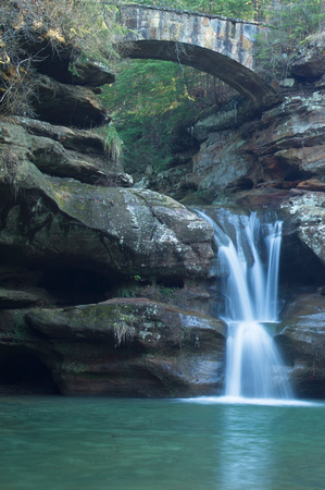
Believe it or not, the camera did appear to be level. I know it doesn't look like it but that is because, as I have determined from numerous shoots, that bridge ain't. It always throws the image into a bit of confusion but, when I try to make the appear level, the shot feels "weird" to me. However, the comments about the water do make me wonder if those levels are sufficiently sensitive as I can see what you are talking about there. I'll tweak that in Lightroom when I edit.

Andy, I do use a variable ND and I use it for exactly as you mentioned, to extend exposures for moving water. I do apologize but I am lacking a bit of vernacular, what is a "PZ" filter? I actually took the RAW materials (I made a photography punny :D) for HDR but wanted to, as I always do, see if there was an "out of the camera" solution. I share your view of much of the HDR examples out there and have to confess to struggling with keeping my own HDR images in my chosen realm of "idealized reality". Instead they end up being, as you said, cartoonish. I use Nik for them and need to play with that toolset more as I have seen images where people have done HDR well.

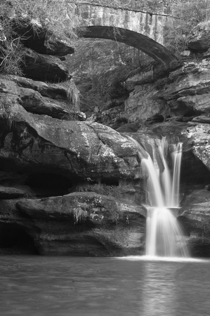
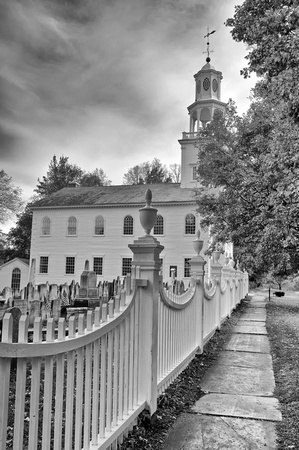
Al, I did a straight B&W conversion so that people could opine on the image and not my editing. I do typically edit a color image with B&W in mind, convert in Silver Efex [sp?] and add additional tweaks using some of its capabilities. Here is one what I did where I had, what appeared to be, an overcast sky and I used some contrast and color filter tweaks and created a forbidding sky for a bit of effect.

Image

Still not a perfect image but quite a bit more refined (in my amateur opinion). What is your usual workflow for a B&W image (really a question for all)?

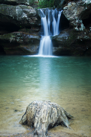
Great input on the blues from the whites, I shall try that. Sadly, I still have not fully edited these or any of the pictures from that trip so I can take all of these insights into my work. Some saturation is definitely in order. I just don't want to turn the water's color into something that would concern the EPA.

I'll also try expanding the crop. I don't have the unedited image in front of me but I'll bet I edited that way due to either clutter or the presence of a short piece of rail that is used to keep people from calling from the cliff. Also possible I just over-cropped.

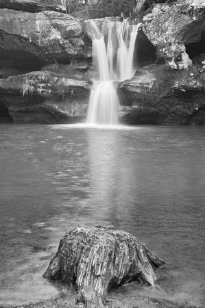
The stump is a bit of a pain while also being somewhat interesting (not unlike myself). It has probably been stood upon, tripped over, kicked or otherwise marred about a million times. That whiting is the effect of the wood being worn down and worn smooth. It looks very white in reality too. That being said, it is still probably a bit over exposed and let me see what I can do with that and next time I will try the water trick and see what I can get out of that. Great idea.

I do have some low angle shots of the stump but I didn't like them as well as I had hoped. I do think I'll try some more when I go next. I also shot some with the stump and falls at a diagonal (as I try to learn what works and what doesn't [both to me personally and within the accepted art form] I try angles that appeal to me, that seem to offer something I can build on and that I know to be "correct" so I shoot quite a bit). I think they suffered due to clutter elsewhere but I'll revisit in editing.


Thank you all for the comments, suggestions and thoughts. I'll try to find some mouse time and see if I can present a v2 with all of this in mind.


autzig
Posts: 440
Joined: Sat Sep 17, 2005 12:01 am
Location: Bloomington, MN
Contact:

Re: Critique #1 2013

Post: # 16530Post autzig
Mon Feb 18, 2013 10:36 am

Dean, I think the "PZ" filter Andy is referring to is a polarizing filter.

Because I don't do a lot of B&W, my workflow is quite simple. I just open a plug-in for B&W and pick the adjustment I like best.

Regarding saturation: Remember that you can selectively saturate your photo. I use Photoshop and not Lightroom so I can only give directions in Photoshop terms. In Photoshop you can saturate the entire photo or you can selectively saturate by color. Alternatively, you can saturate the whole photo and use a mask to reduce the effect in the pool for example. If you have the Nik suite, you can use Viveza to selectively saturate too.

If your crop is tight because of junk in the photo, it is better to clone out the junk than have a crop that is too tight.

Watering down bright rocks is something I do often. I assume it will work with this stump, but make sure you get the whole thing wet. You don't want any telltale signs of your trick to show on the photo.

I really like the B&W photo of the church. I love the repeating lines of the fence and the fence post in the foreground mimics the steeple in the church. Even the headstones appear to match the spokes of the fence. The fence and the walkway lead the eye to the subject. This is an exceptional composition. The B&W conversion is very good too.

Al

deaner1971
Posts: 449
Joined: Wed Sep 03, 2003 12:01 am

Re: Critique #1 2013

Post: # 16531Post deaner1971
Mon Feb 18, 2013 11:12 am

Al,

Thanks. Yeah, I should have guessed a polarizer. I use those most of the time with foliage or water.

Thank you for the compliments on the church. This year I plan to shoot it with my IR filter (Christmas present) and see if I can go full-creepy with that tree giving off an other-worldly light and all.

Thank you again for all of the input. I'll work on the saturation (I usually increase it little to none and thus, have neglected that skill-set, especially doing it selectively but I will work on it). Cloning to allow me to change the crop is also something to which I need to be more open. I don't take shots if there is something in the image I don't like and I need to embrace that digital photography doesn't force me to do that. I have edited people out of images but rarely anything permanent or natural and have probably missed some good shots due to my own irrational resistance to this.

Thanks.

Dean

Andy
Posts: 1562
Joined: Sun Sep 18, 2005 12:01 am
Location: Saginaw, Michigan
Contact:

Re: Critique #1 2013

Post: # 16533Post Andy
Tue Feb 19, 2013 7:22 am

Dean: I did mean polarizer (sometimes laziness is confusing).

I don't think Al has Photoshop CS6 yet, but in 6 there is an even easier way to straighten an image. They have changed the crop tool (it is more like the Lightroom crop tool now). In 6 (and, I think in LR4) there is a straighten tool within the crop tool. You click the crop tool, then click the little ruler up on the toobar across the top, and draw a straight line on anything in the image the shoul de hoizontal level (I think it actually works for vertical lines too). Pretty smart. You can constrain the crop dimensions at the same time if you want, or, there is a choice for "unconstrained" crop.

If you have Viveza, here is my favorite way to "fix" whitewater in waterfalls. Hard for us to see on our monitors, but there is usually too much blue cast in these (it will show up in the print). I go into Viveza and set a control point on the whitest area and adjust the circle to only affect the water. The desaturate (- saturation slider) a fair amount: between 75 - 90%. The water should lool just slightly grey (just enough so your printer won't leave areas with no ink). I bump up the contrast (no more than 20), and decrease the brightness slightly. Works great for fog and mist rising off a pond, too. Once you have it to your liking, you can alt-click and drag copies of the contril point to other areas in the image. In a complex waterfall, I may have several small control points set.

On the HDR piece, I think the whole concept was originally developed by photographers who were simply trying to capture and display more dynamic range. When the first guy did the cartoon thing, it was unique. The next 50,000 guys? Eh. I love how they try to make it better by labeling it "painterly" :-)

It is really just a very sophisticated blending algorythm. Photoshop users have done a version of this by hand for years -- but having tried it, its really hard and lots of work. So I let the software (in my case Photomatix) do it. But I only use when I cannot make a single raw image work and I use it very sparingly, trying to maintain a photographic look. I downloaded the trial of NIK HDRSoft and tried it. Its the one NIK product I think missed the mark. Maybe its just me, but it seems way too heavy handed. I like the more subtle approach in Photomatix (but admit to a fair amount of user ignorance). Photoshop also has it built in, but again, I think Photomatic does it better (did a comparison on my blog a year or so ago).
Andy

If it sounds too good to be true, its probably . . . .

deaner1971
Posts: 449
Joined: Wed Sep 03, 2003 12:01 am

Re: Critique #1 2013

Post: # 16535Post deaner1971
Tue Feb 19, 2013 9:11 am

Andy,

Thank you for that great tip on using Viveza. Let me try that a bit and I'll add it to my workflow for waterfalls. Viveza is still having performance issues on my machine (LR, PSE and all of the other Nik tools have no issues so there is some issue there that I cannot seem to uncover) but I have been sucking it up and living with it because I do see some wonder functionality there.

Agree that HDR is the one thing that Nik has not yet perfected. As I am using Nik for HDR, perhaps that is why I am not embracing the art. The adds for Photomatix is one of the ones that use a "overuse" of the tech and that has put me off, which is unfair but fit with my existing prejudices against HDR and thus went unchallenged. Perhaps I will try a demo. I also purchased Perfect Layers with the intention of just using the workflow to uncover bits and pieces of dual images but that, as it had for enough people to spawn new HDR specific software, seemed too labor intensive.

I have my eye on a new lens (f2.8 25-70, or about those specs) that will allow me to have fast glass from 17 through 200mm albeit across three lenses and then I am going to relegate my 18-200 to all purpose things like family trips to the zoo. the quality on my all-in-one just isn't good enough for larger prints. Once that is done, my next big purchase will be PSwhatever. I know that I am missing out in the editing space for not having it. Other priorities have had to take precedence in my negotiations with the finance committee, however. As the website will still be here when I do get it, keep firing off tips when you think of them!

Thanks again for the insights and tips.

Andy
Posts: 1562
Joined: Sun Sep 18, 2005 12:01 am
Location: Saginaw, Michigan
Contact:

Re: Critique #1 2013

Post: # 16537Post Andy
Wed Feb 20, 2013 7:08 am

Remind me again, Dean, what body (am particularly interested in sensor/sensor size) you are shooting? I am shooting Nikon FX (so- called " full frame"). They relate to the old tradional lens focal lengths. Most of the "consumer/prosumer" bodies offered by the Nicanon monopoly are APS sensors, with a smaller area. A couple offer the 4/3 size, which is also smaller. They introduce a "crop factor" in effect rendering the field of view like that of a longer lens. My point is that if you are using one of these senesors, you might want a wider zoom than the 24-70 range. The typical factor is "around" 1.5x. So 50mm is going to look like 75. Nikon offers the "full range" zooms in 18-200 for their APS. and 28-300 for FF. Both are pretty darn "estimable" lenses, but as you point out, they start to show their limitations with large and/or detailed prints.

I shifted to all "pro" zoom lenses late last year. I am shooting a 24-70 and 70-200' and have a 2x for the bigger lens (which is also vibration reduction). They require you to focus (pun intended) on your technique and really should also come with a sherpa to lug them around :-). I really saw this with my recent cruise. I actually just bought an inexpensive 24-105 consumer lens for those "just walking around" conditions. I miss the 28-300' convenience and versatility and would urge you to hang onto it as you have suggested.
Andy

If it sounds too good to be true, its probably . . . .

deaner1971
Posts: 449
Joined: Wed Sep 03, 2003 12:01 am

Re: Critique #1 2013

Post: # 16540Post deaner1971
Wed Feb 20, 2013 8:56 am

I shoot Sony bodies. I was a Konica Minolta user and, when they were bought by Sony, I went to Sony as Sony kept the lens mounts.

Specifically, I use the a580. It uses an APS-C sensor so I do have a factor on each lens that I have to keep in mind. My widest is a 17-35 2.8-4 so I wanted the 28-75, to fill the gap to my 70-200 2.8. I also am looking at upgrading the 17-35 2.8-4 to a 17-50 2.8 relatively soon.

I use an extra battery pack/vertical grip so that, plus two batteries, plus the body, plus the 70-200 is why I have a tripod that can actually work as a swing for my kids (40 lbs max weight). Even with that (and using a cable release) I feel I am seeing vibration at times.

Sony's current full-frame is the a99 which is about $2600 (body only). Definitely a wish list item but, it will have to wait until I get the glass squared away. No point in buying a Ferrari if I only have bargain basement tires for it.

Andy
Posts: 1562
Joined: Sun Sep 18, 2005 12:01 am
Location: Saginaw, Michigan
Contact:

Re: Critique #1 2013

Post: # 16541Post Andy
Fri Feb 22, 2013 5:53 pm

Don't know how many MP the Sony FF is, but with FF in general and larger MP, you will start to see the "worts" in your technique.

Liked the Church shot, BTW
Andy

If it sounds too good to be true, its probably . . . .

deaner1971
Posts: 449
Joined: Wed Sep 03, 2003 12:01 am

Re: Critique #1 2013

Post: # 16545Post deaner1971
Mon Feb 25, 2013 8:43 am

It is 16.2 effective (16.7 total). FF is definitely a route I want to go, just needs to work its way up the list.


Post Reply