Critique #5

Discussions on Equipment, Locations and Tips for getting the photographs you want of Vermont scenes.Note: You must be registered in order to post. If you have trouble registering, use the contact us form on Scenes of Vermont's home page.

Moderators: Andy, admin

Post Reply
From_the_NEK
Posts: 377
Joined: Wed Sep 16, 2009 9:39 am
Location: Lyndonville, VT

Critique #5

Post: # 14751Post From_the_NEK
Tue Nov 29, 2011 2:34 pm

I already know I need a better camera to improve my picture quality (currently shooting with this: http://www.dpreview.com/products/sony/c ... sony_dsch7) I finally got a polarizing filter (after foliage season :roll: ) and I need to get a new tripod (I lost a leg off my $20 tripod somewhere around northern VT this fall). That being said, I have been trying to improve the composition of my shots even though I know the camera isn't going to help me.

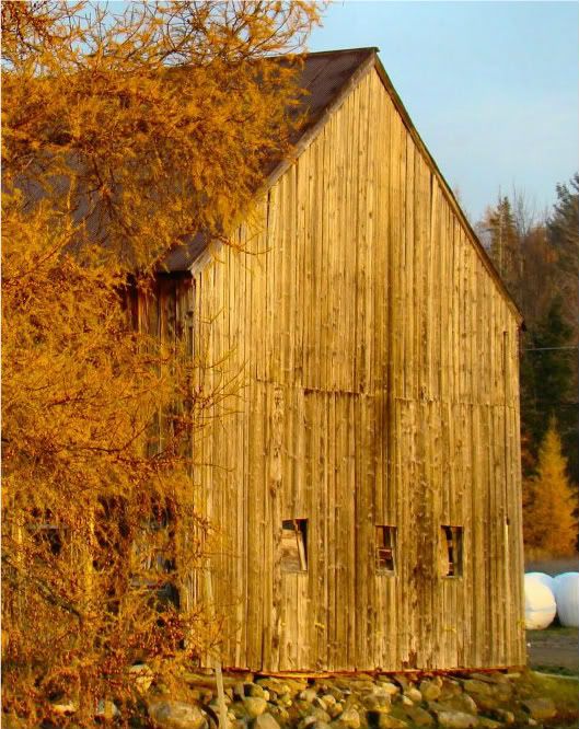
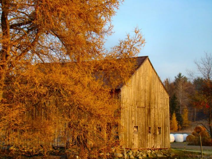
Here is an unedited shot from the very tail end of this years foliage season on a cool morning just as the sun cracked over the mountains. I tried to get the tamarack in the foreground to draw your focus to the barn. The pile of haybales (wrapped and unwrapped) and the red apples lead you off the right side. Have at it :D

Image


Andy
Posts: 1562
Joined: Sun Sep 18, 2005 12:01 am
Location: Saginaw, Michigan
Contact:

Re: Critique #5

Post: # 14752Post Andy
Tue Nov 29, 2011 2:48 pm

Hi NEK: For starters, I think you are going to need to resize your image down so it fits the screen. The forum software apparently has limitations on what it will display. We have all had some issues with the software cropping our images weirdly over the years. I find that 72 dpi and about 720 pixels on the long side of the image fits rather nicely.
Andy

If it sounds too good to be true, its probably . . . .

From_the_NEK
Posts: 377
Joined: Wed Sep 16, 2009 9:39 am
Location: Lyndonville, VT

Re: Critique #5

Post: # 14757Post From_the_NEK
Wed Nov 30, 2011 12:24 pm

That should do it

Andy
Posts: 1562
Joined: Sun Sep 18, 2005 12:01 am
Location: Saginaw, Michigan
Contact:

Re: Critique #5

Post: # 14762Post Andy
Wed Nov 30, 2011 6:49 pm

Thanks for jumping in here, NEK: My two cents (two things to remember -- it is the image, not the photographer being critiqued and critiques are 99% opinion -- you are the artist -- take critique with a grain of salt and FWIW).

First, having a "better camera" is not the first step to improving photography. There is no doubt that a camera is a tool, and the "higher end" DSLR cameras give you more "tools" to work with. But the tools don't make the image, the photographer does. You can make some incredible images with modern point and shoot cameras. I use a Canon G11 P&S as a "carry around" camera and am continually impressed at its results.

Second, do you have a "vivid" or "saturated" setting on your camera and do you have it turned on? The image seems to be highly saturated and that gives it an odd color cast. Those leaves and the barn wood just don't look natural to me on my monitor (and as you know from reading the banter and serious discussion between Al and me, I like a saturated image). I can show you what I mean best by uploading a "processed" version of your image, but will not do so without your express permission. If I have permission, I can post some illustrations of my points.

For starters, I would like to see more "space" near the bottom of the image, where the stone foundation is. It leaves me wondering if there is "more" there.

Second, there is no "detail" in the leaves (increased digital saturation decreases detail - this may be the culprit). EVERY ditigal file needs some sharpening. Again, if your camera has some kind of sharpening setting, it is probably doing that. But it appears to me that this image could benefit from "post processing" sharpening.

Third, I agree with Carol. I would like to see a tighter crop of the image. On a couple of the other threads, Brandt has mentioned "subject." It is the most important question to ask ourselves as the shooter: "what is my subject" or "what am I trying to "show" the viewer"? In this case, I think it is the barn. So looking at the other elements of the image, do they add or detract from it? There is too much "clutter" (I think you mention that in your post) on the right.

Graphics experts tell us that the eye is drawn first to brighter/lighter objects within an image. So the "marshmallows" immediately pull they eyes -- trouble is, they are not the subject. I hate the white marshmallows and worms in the fields that have ruined my bucholic VT :x . How much more photogenic would bales of natural hay be? The other object that "bothers" me is the electric fence post with the yellow insulators. I would clone both of them out, and would also probably crop the tree with the part red leaves on the right out of the image. This would probably mean cloning out the remaining stacked round bales on the right. To achieve balance, I would crop some of the sky out too.

Something in the photo has made the sky uneven in color also. I wasn't able to figure that one out. I can post a couple example re-works, if you are interested in seeing "my take."

Overall, barns are great subjects, with their weathered wood. I like your idea here and can see that the subject has a lot of promise.
Andy

If it sounds too good to be true, its probably . . . .

autzig
Posts: 440
Joined: Sat Sep 17, 2005 12:01 am
Location: Bloomington, MN
Contact:

Re: Critique #5

Post: # 14764Post autzig
Wed Nov 30, 2011 9:00 pm

If Andy thinks your photo is over saturated, it must be, because he is the king of saturation.

Andy's comment about the subject is a good one. The tamarack tree takes up about 50% of the image. If you are filling 50% of the frame with something, it should be the subject. If the subject is the barn, give it 50% or more of the frame.

The frame is almost cut in half with the tree on the left half and the barn and everything else on the right. The comments about CT's barn and silo photo apply here. The blank sky fills about a third of the right half of the photo. If you give that much space to a feature in the photo, it should contribute something. I don't think the sky adds anything. If you had some nice puffy clouds, that would help but minimize the clear sky unless it makes a major contribution to the photo.

I love tamarack trees (they are called Larch trees in the West, for anyone who is interested) in autumn because they turn a really nice golden yellow. Your tree looks brown. When I see that color foliage, I think the tree is dead. I agree with Andy about the white bales. They really are a distraction.

You have some nice warm light and a nice setting that could offer some nice photo opportunities.

Al


deaner1971
Posts: 449
Joined: Wed Sep 03, 2003 12:01 am

Re: Critique #5

Post: # 14767Post deaner1971
Thu Dec 01, 2011 9:27 am

Could you just crop pretty close to the right hadn side of the barn and then edit out what little white would remain from the rolls (I too prefer the old days of hay bailing and always though those plastic rolls look like giant rolls of toilet paper)? That would eliminate the less appealing right side elements and reduce the amount of open sky.

One other item that may be contributing to the apparent need for sharpening is I think there is a chromatic shift in the image. I seem to be seeing (and without being able to zoom into the original photo, I cannot be certain) some shifting at the top of the rolls that makes me think that could be an issue with the image.

Andy
Posts: 1562
Joined: Sun Sep 18, 2005 12:01 am
Location: Saginaw, Michigan
Contact:

Re: Critique #5

Post: # 14772Post Andy
Thu Dec 01, 2011 4:05 pm

I am certain that the agriculture experts knew what they were doing making that plastic pure white (maybe to reflect sun off the hay and therefore cut down on the solar heating). But I have often wondered if there might be something to making a "hay colored" plastic?
Andy

If it sounds too good to be true, its probably . . . .

From_the_NEK
Posts: 377
Joined: Wed Sep 16, 2009 9:39 am
Location: Lyndonville, VT

Re: Critique #5

Post: # 14777Post From_the_NEK
Fri Dec 02, 2011 1:12 pm

Is this more in line with what is recommended? If not, anyone can feel free to modify the original as they see fit.

Image

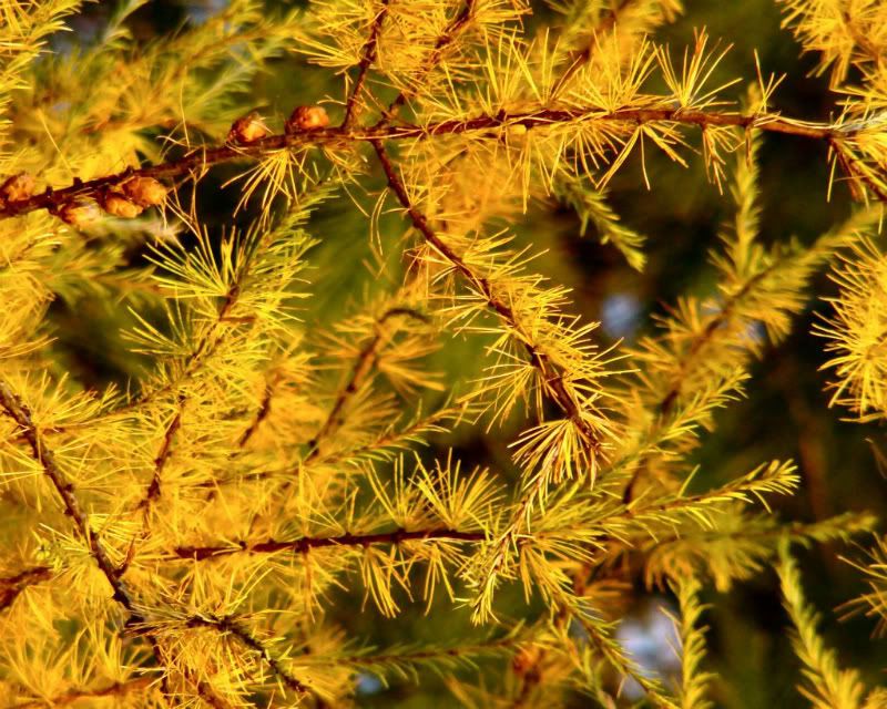
I didn't touch the saturation on this image. I'll have to check for the "Saturation" setting on the camera. The early morning lighting was strong toward orange which I think is what gave the yellow tamarack needles a brown tint. And those tamarak needles are small and arranged in a pattern that may make them appear out of focus or they are hard for the camera to autofocus on (not sure which it is here). Below is a closeup of the needles.

Image

I left the white hay bales (and yes they are white to reduce the heat in the bale, when first wrapped, the bales actually create a lot of heat on their own). I'm not a fan of removing items of a picture (other than cropping them out). After the crop I don't think they are as much of a distraction. Too bad the "natural bales" that are furthest to the right were not where the white bales are.

As for capturing more of the foreground... I would have had to move the vehicles out of my driveway as this shot was taken looking over the top of them from my deck :lol: The area in front of the barn is mostly a bunch of mud anyway.

Andy
Posts: 1562
Joined: Sun Sep 18, 2005 12:01 am
Location: Saginaw, Michigan
Contact:

Re: Critique #5

Post: # 14782Post Andy
Fri Dec 02, 2011 5:06 pm

Here's my "take" - I didn't crop it severely -- didn't really think about that. I like your second version as it puts the barn front and center and emphasizes the weathered wood, but I don't know that its necessary to crop it so much -- i.e., both "work" for me.

I have no problem removing articles from an image that detract or do not enhance it, as long as I am not trying to be dishonest. In my view, it is art and the resulting image is certainly something that "could be."

Note that when trying to "correct" the color on this small jpg, I ended up degrading the image. I can't seem to get the sky to balance with the barn, but I definitely think there was some color shifting going on there. On the image below there are some definite chromatic aberations going on, which I suspect is a result again of trying to do to much "moves" with a small jpg.

Image
Andy

If it sounds too good to be true, its probably . . . .

deaner1971
Posts: 449
Joined: Wed Sep 03, 2003 12:01 am

Re: Critique #5

Post: # 14788Post deaner1971
Mon Dec 05, 2011 8:21 am

Andy, I had the same problem and ended up moving toward the same color cast that you have. On one hand I felt like it made the picture kind of dreary but I am also drawn to the increased texture I felt like this gave the wood of the barn. The bottom of the barn (right along the stone foundation) still seems to shown a reddish hue that makes me think the colors are out of alignment. I'll tinker in LR and see if I can tweak that.


Post Reply